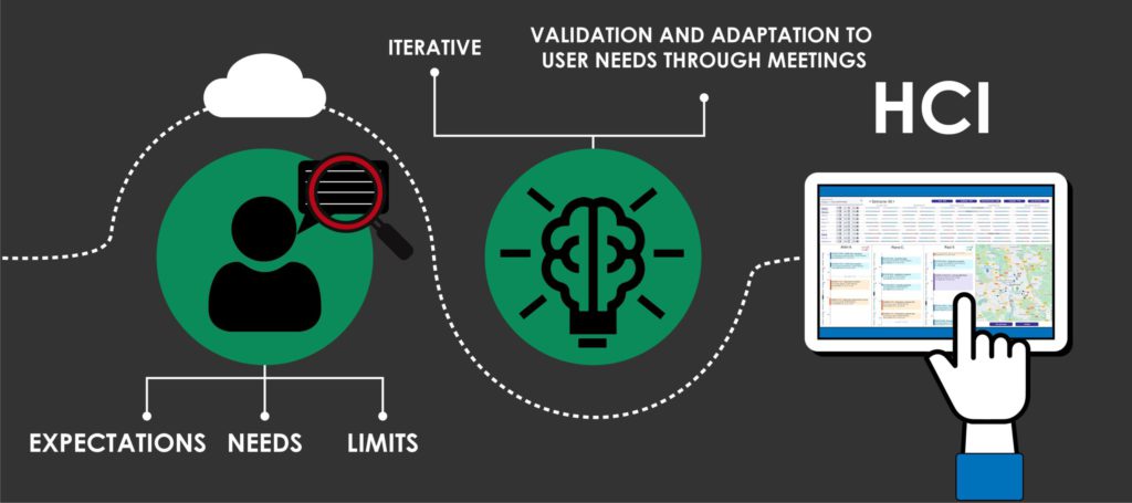
Scheduling staff interventions can easily become a hard work with all the constraints to consider (working time, required skills, localization…). So our team worked on an optimized engine which generates a relevant schedule according to the constraints and standards added by the user (see the corresponding articles for CARL Source or BL.Domicile). But we wondered: how would users understand and accept a schedule generated by an artificial intelligence, when they usually do it themselves?
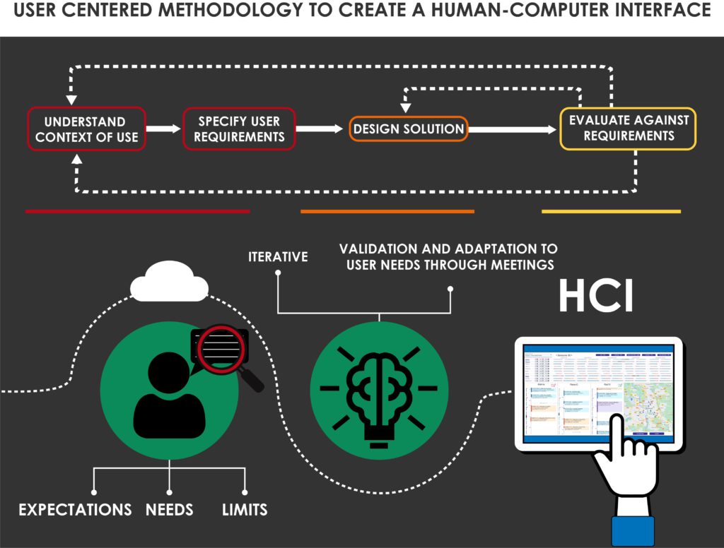
To understand this and propose an interface usable by different planners in different cities or countries, we based our research on the users. We gathered information through different meetings (semi-directed interviews, test and validation), in order to determinate their needs, how they use planner tools, what could make the difference with other existing tools and their acceptation threshold of artificial intelligence.
To answer our question, Data Visualization is a key factor. It allows the planners to easily understand and accept the schedule automatically generated by Artificial Intelligence. In this case, we studied three use cases: maintenance, home healthcare and meal delivery.
Our methodology to test human confidence in AI
During this project, our main preoccupation was to understand how planners will accept Artificial Intelligence to generate schedules. So we built four scenarios (figure 1) and asked the users to classify them from most acceptable to least acceptable.
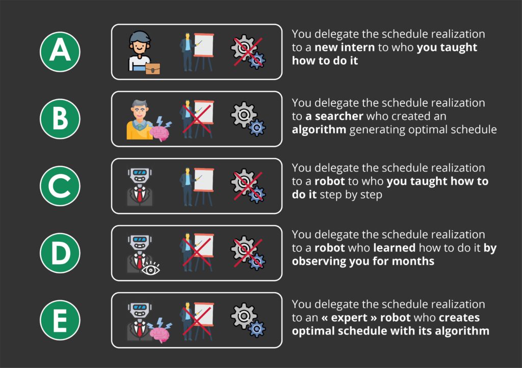
- Situation A is generally judged the most worrying because the intern doesn’t have the required experience and enough responsibility to be in charge of this task. Though it has the advantage to be a “human” adaptive and progressive solution.
- Situation B and E are globally evaluated the same (though, the solution E doesn’t include human): even if theoretical knowledge insures the basic functionalities, the work environment, human understanding and practical experience are missing to provide well made schedule.
- Situation C and D are preferred because they include a better control on AI and its evolution/learning process.
Through this test, we learned how important human control and field experience are for professionals interacting with AI.
Interface structure
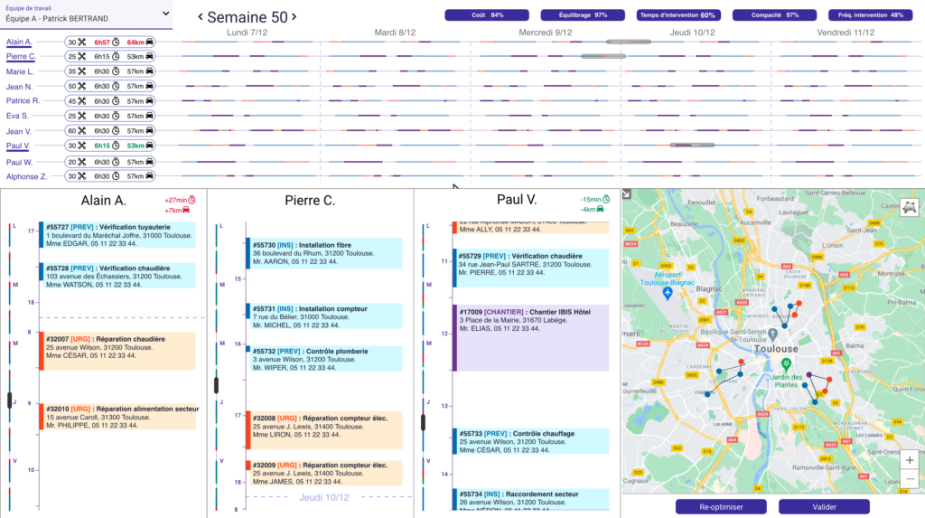
The main functionalities of our interface are to visualize, generate, modify and check the schedule to verify if it’s in accordance to its requirement (also a way to give control to human on artificial intelligence).
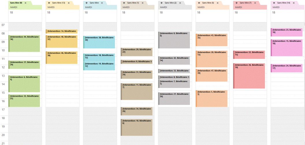
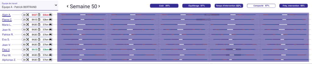
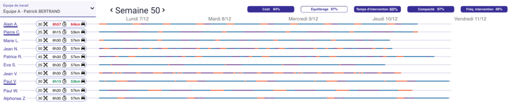
It is composed by three main parts (Figure 2): the upper panel for the team’s week planning, the lower left panel for the detailed workers’ planning and the lower right panel for the map with selected workers’ itineraries, plus two buttons to confirm or re-optimize the schedule.
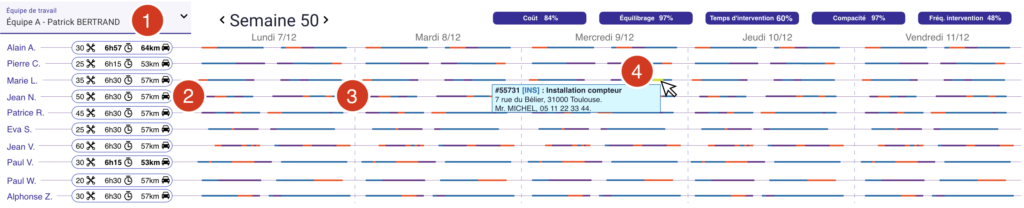
The upper panel (figure 3) is made of:
- A menu allowing to select the team (1).
- The intervention timelines for each worker of the selected team. You can find for each participant:
- Three icons representing essential information: number of interventions, total time of intervention and total distance covered (2).
- Horizontal timelines representing the worker’s missions (3). The color of each bar depends on the kind of intervention. Going over with the cursor highlights it and displays detailed information about the intervention (4).
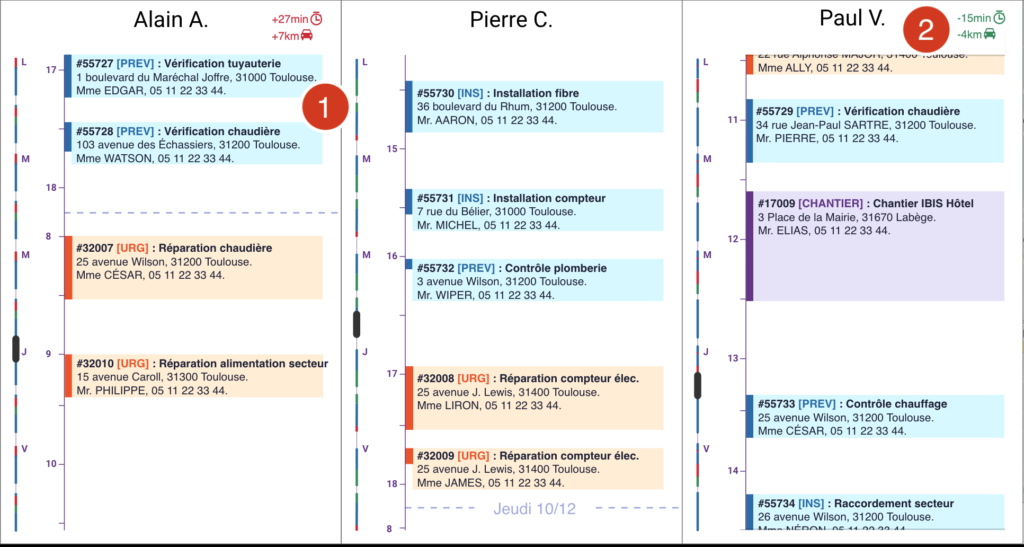
- When selecting a worker, a detailed panel is displayed in the lower panel (figure 4).
The lower left part (Figure 4) presents vertically the detailed planning of each selected worker. They are composed of:
- Boxes representing the interventions with a short description (1). In order to modify the planning, those boxes can be dragged and dropped in a same schedule or between two different ones. A colored text (red or green) informs about the impact of the modification compared to the generated schedule (4).
- Sliders synchronized between the global view and the detailed view.
Optimization score
To reinforce user faith and help them to better understand how our schedule generation algorithm works, we thought about a scoring function of the schedule optimization. The score reflects how well the solution generated by the algorithm takes into account the user’s requirements.
We explored two main ideas:
The first approach was to use “Waffle charts” to display the score. The chart is composed of icons representing the different requirements, the number of icons is proportional to their impact in the rating score. All ratings are out of 10.
A click on the global score launches an animation to fill bigger icons representing each requirement (Figure 5).
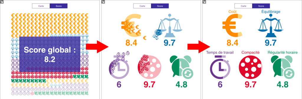
The second approach was to explain the scores by showing their impact on the activity. The scores are shown on buttons indicating each requirement. Clicking on a button transforms the team’s timeline to illustrate the corresponding requirement: highlighting breaks in the schedule for “Compacity” requirement (Figure 6), stacking the mission bars to compare workers’ workload for “Balancing” (Figure 7) etc.
We tested both solution mock-ups during meetings with different users and planners. They seem to prefer the second, more discreet solution. Their feedback was mainly positive on the organization of the interface, its functionalities and its interactions:
- It “allows to see all the details immediately“.
- “The global view is very useful to see if we can adjust the schedule with emergency intervention“.
- The interface is “cool, clear and pleasant” and make users want to work with it.
To resume
By applying a user-centered methodology, we designed an efficient Human-Computer Interface that supports the user’s confidence in the system. We didn’t work through our believes but with the right information collected from the people who will use the application throughout the process.
The main takeway from this project is than people trust artificial intelligence, as long as they keep control over the last modification or validation. Also, the performance score of the Artificial Intelligence only makes sens for them if it is related to their work context.