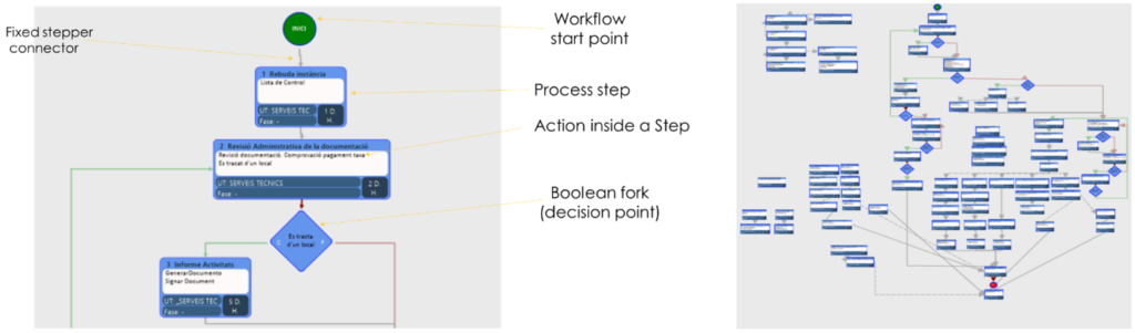
The time spent processing administrative requests has an impact on citizen satisfaction. Improving administrative workflows is therefore an important objective for town halls. A workflow is made of a starting point, several parallel or sequential process steps (containing one to several actions, and a theoretical completion time) and decision points (Figure 1) to be processed by employees from different services of the city hall.
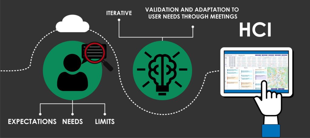
Each City Hall builds the workflows in his own way and each service and user manages the workflow differently, so it is hard to gain insights on the actual use of workflows and the potential improvements. The City Halls thus need a tool to visualize the workflows (steps, users, services, time spent) and identify the bottlenecks (time spent on each step, overdue completion date) to improve their services.
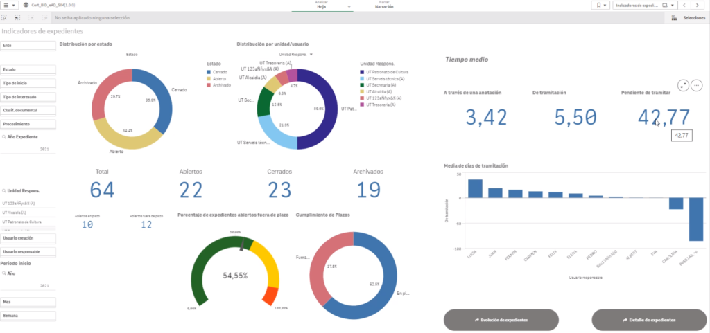
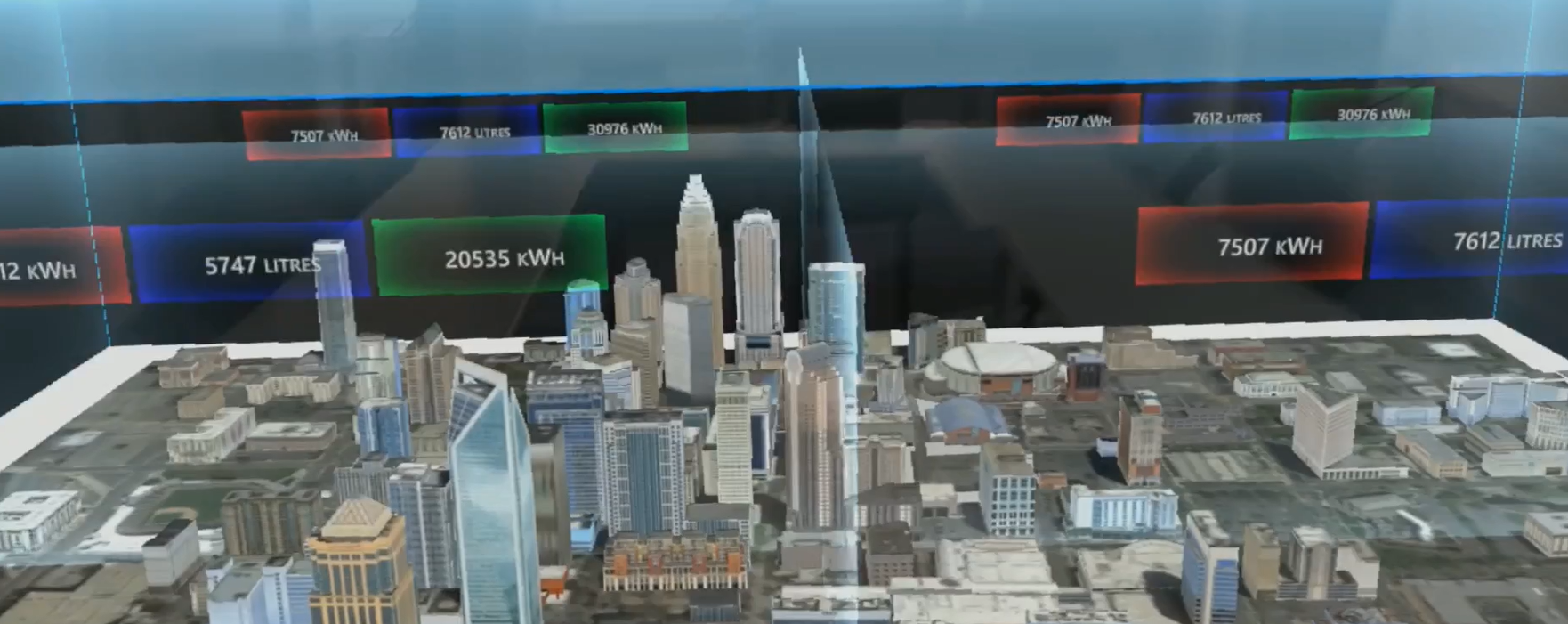
These needs can be answered by displaying a set of various specific indicators in a business intelligence tool (Figure 2), or by representing and navigating the data as a whole in an interactive data visualization. The question we are trying to answer is:
What are the pros and cons of an interactive data visualization
compared to a Business Intelligence dashboard?
Inspired by research works on flow visualisations [1,2,6,7], temporal event representations [4,5] and process mining tools [3,8], we conducted various design iterations between the DRIT and Berger-Levrault Spain. The result is an interactive interface divided into two steps:
1. Visualising the workflows depending on their frequency of use and their delay ratio.
This first screen presents a ScatterPlot diagram (Figure 3). Each point represents a workflow. The points are placed along two axes. The vertical axis represents the delay ratio of the workflow (how late the workflow was on average) and the horizontal axis presents the number of instances (how many time the workflow was used). The size of the point depends on the number of late instances (how many time the workflow was late). The higher up on the right the workflow is, the more it is used and delayed, and thus the more problematic it can be.
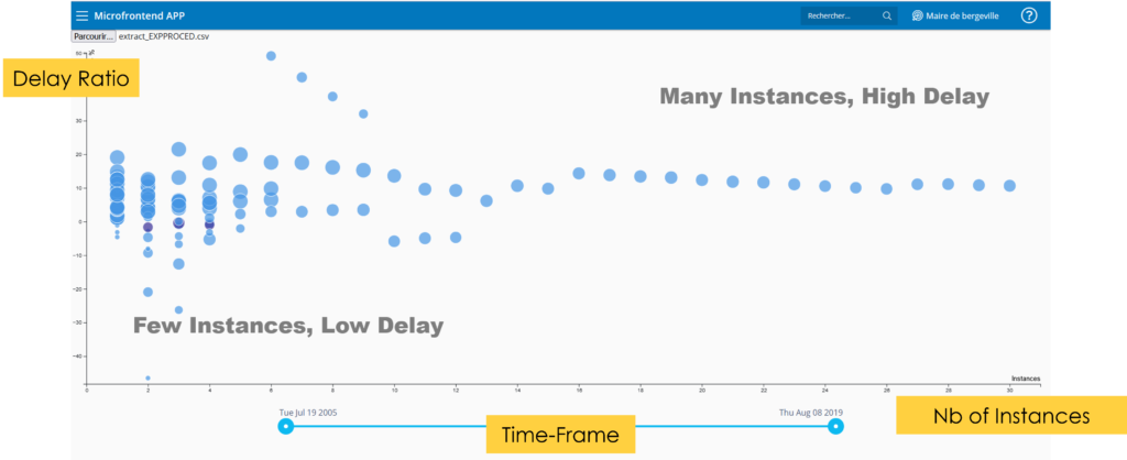
This first visualisation shows which workflows are the most problematic and helps to choose which ones to display in detail in the next visualisation.
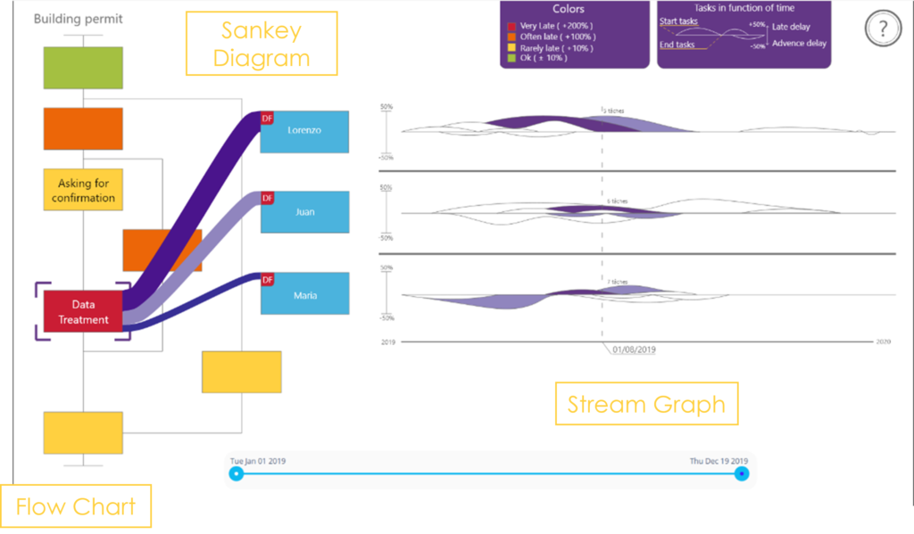
2. Visualising the steps of a workflow, their delay, and their affectation among city hall employees
The second screen (Figure 4) is divided into three sections, with progressive disclosure to facilitate reading and understanding. The user starts by identifying the most delayed workflow steps in the left-hand visualisation. This visualisation is based on the flow chart visualisation already known by Simplifica users, with the delay being color-coded (red for late, green for on time). When selecting a step, he can see the distribution of the step executions among employees (purple Sankey Diagram in the middle, the thickness of the link indicates the number of executions). Finally, he can visualise the employees’ workload according to the calendar in the right-hand Stream Graph. Each “wave” is a task, the length of which represents the duration and the thickness the delay. The superposition of the waves gives the employee’s workload at each moment.
Web implementation of the application
The application architecture is based on Angular framework written in Type Script. To graphically visualise informations, we chose to use the D3J3 library. Its versatile quality took advantage on other libraries though it has to be entirely programmed. The web application is based on micro-frontend architecture which allows to split the visualisation in different visual parts. This recent architecture fragments its components in individual part, so the different team members can work simultaneously on the code and development of the app. Differents app tools feature allows to communicate between the components.
We developed the application with a component for each visualisation and communication channels between them, as you can see in figure 5.
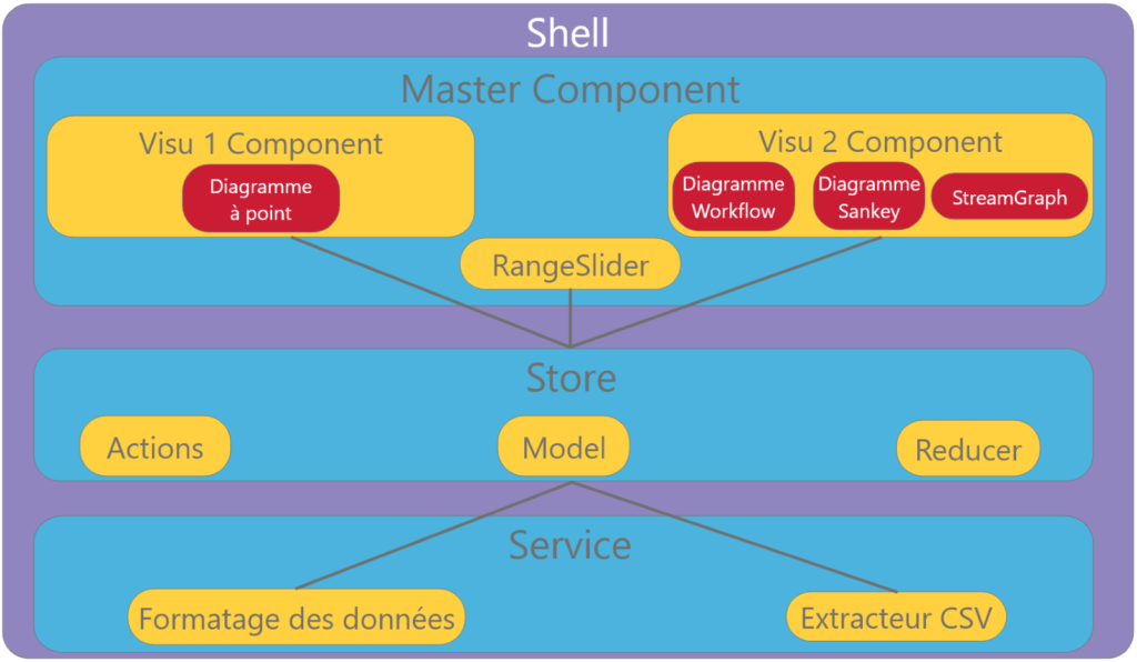
Through this structure, data calculation and formating is optimised because they are shared in the Store, where all components are connected.
The user can now use the application.
The prototype we’ve created allows to compare differents workflows delays and analyse their causes. With simple design and intuitive sequence, the user is assisted all the way of his using experience. Breaking down the process in steps (two visualisations) and substeps (progressive display on the second visualisation) avoids to overwhelm the user with informations. He can filter them step by step to precisely target the delay problem.
The next step of the project will be to test and compare the two visualisations (Dashboard on figure 2 and our prototype) with our users targets: Spanish city hall.
References
[1] Aly Abdelalim and William O’brien. 2017. Visualization of Building Performance using Sankey Diagrams to Enhance the Decision-Making Process. https://doi.org/10.22360/simaud.2017.simaud.016
[2] Sara Di Bartolomeo, Yixuan Zhang, Fangfang Sheng, and Cody Dunne. 2020. Sequence Braiding: Visual Overviews of Temporal Event Sequences and Attributes. IEEE Transactions on Visualization and Computer Graphics: 1–1. https://doi.org/10.1109/tvcg.2020.3030442
[3] Christian W. Günther and Wil M.P. Van Der Aalst. 2007. Fuzzy mining – Adaptive process simplification based on multi-perspective metrics. In Lecture Notes in Computer Science (including subseries Lecture Notes in Artificial Intelligence and Lecture Notes in Bioinformatics), 328–343. https://doi.org/10.1007/978-3-540-75183-0_24
[4] Miloš Krstajić, Enrico Bertini, and Daniel A. Keim. 2011. Cloudlines: Compact display of event episodes in multiple time-series. IEEE Transactions on Visualization and Computer Graphics 17, 12: 2432–2439. https://doi.org/10.1109/TVCG.2011.179
[5] Dongning Luo, Jing Yang, Milos Krstajic, William Ribarsky, and Daniel Keim. 2012. Event river: Visually exploring text collections with temporal references. IEEE Transactions on Visualization and Computer Graphics 18, 1: 93–105. https://doi.org/10.1109/TVCG.2010.225
[6] Patrick Riehmann, Manfred Hanfler, and Bernd Froehlich. 2005. Interactive sankey diagrams. In Proceedings – IEEE Symposium on Information Visualization, INFO VIS, 233–240. https://doi.org/10.1109/INFVIS.2005.1532152
[7] Mario Schmidt. 2008. The Sankey Diagram in Energy and Material Flow Management. Journal of Industrial Ecology 12, 2: 173–185. https://doi.org/10.1111/j.1530-9290.2008.00015.x
[8] Minseok Song and Wil Van Der Aalst. 2007. Supporting process mining by showing events at a glance. In Proceedings of the 17th Annual Workshop on Information Technologies and Systems, 139–145.