From carbon emissions to national budgets, we’re frequently asked to interpret values that span from thousands to millions and billions. These wide ranges—what we call Orders of Magnitude Values (OMVs)—are cognitively demanding for the general public and hard to represent with common charts. So, how can we make sense of large numbers in order to promote understanding of complex data among the general public? Below, we present the findings from our latest study on effective alternatives that may better correspond to how people perceive large numbers.
A real-life example for the general public
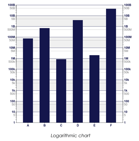
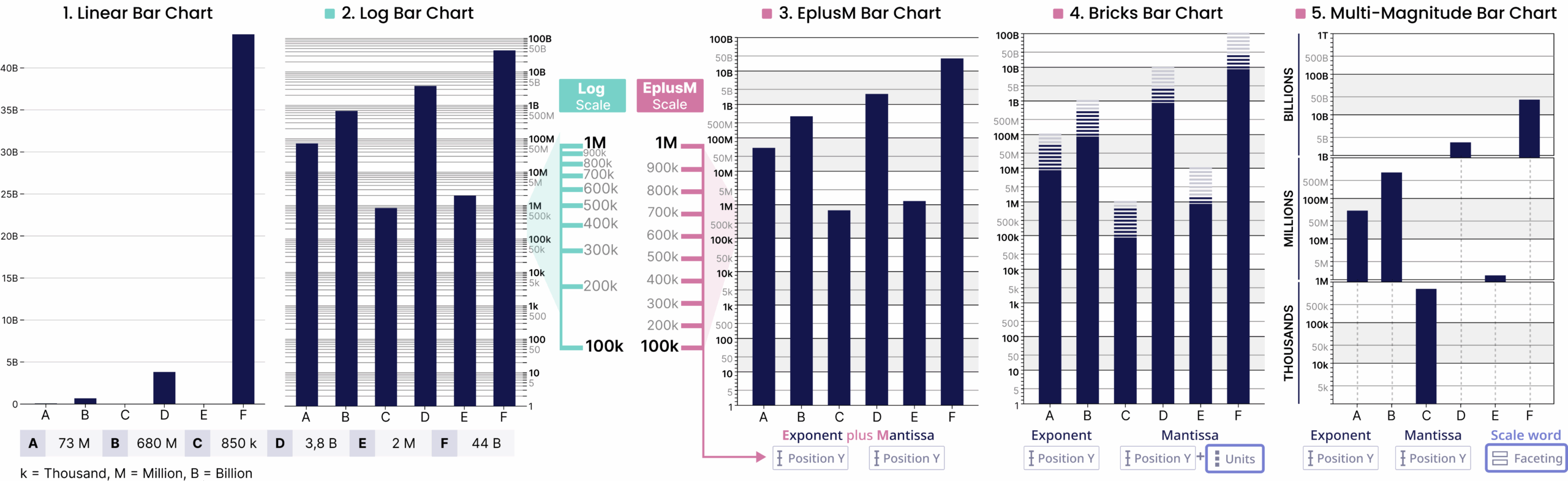
Let’s begin our article with a clear and striking illustration of our proposal: the example of the French national budget (see Figure 1) for allocations. For example, where allocations range from tens of thousands to hundreds of billions, a linear bar chart hides smaller values (Figure 1.1). A logarithmic bar chart can display all categories (Figure 1.2), but many people struggle to read and understand log scales.
So, what added value does our visualisation proposal (Figure 1.3-4-5) bring to this quest for meaning? And how did we get here?
Why people struggle to understand logarithmic charts?
Human perception of numbers is not consistent across all scales. For small values, we tend to think in equal steps—seeing the difference between 1 and 2 as similar to that between 2 and 3. But as numbers grow larger, this sense of proportion changes. People often perceive large quantities in relative rather than absolute terms, focusing on ratios instead of exact differences. This makes it difficult to grasp how much larger, for instance, 5 billion is compared to 200 million.
Research suggests that people don’t interpret large values on a logarithmic curve but rather in segments. Within each magnitude range—thousands, millions, billions—we estimate values roughly linearly, then “reset” at the next scale. This piecewise or segmented way of thinking reflects how we mentally group numbers into categories rather than continuously scaling them. These insights reveal a mismatch between how people naturally perceive large numerical magnitudes and how they are often shown in visualizations, especially those using logarithmic scales. While such scales are mathematically precise, they do not align with intuitive human reasoning.
What we propose
Inspired by this segmented perception of large numbers, in a previous study [1] we explored visualization approaches that decompose a value into two components—mantissa and exponent—similar to scientific notation. For example, in 80 000 000 000 (8 × 10¹¹), 8 represents the mantissa and 11 the exponent. The mantissa increases linearly from 1 to 9 inside each exponent segment, mirroring the way people perceive large numbers. Through a qualitative expert evaluation and a crowdsourced experiment, we found that mantissa–exponent visualizations can address limitations of linear and logarithmic scales.
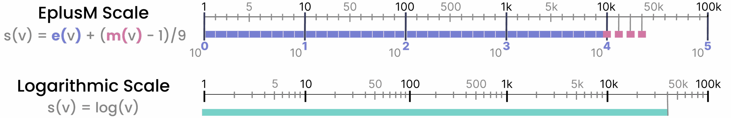
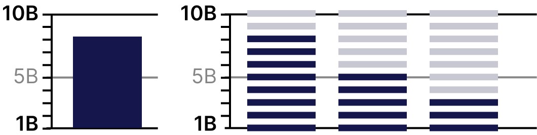
Among the explored visualizations, the EplusM (Exponent + Mantissa) scale showed promising results as an effective alternative to the dominant solutions. Visually, EplusM looks much like a log scale, but with one crucial difference: within each decade (between two consecutive exponents), position is linear (Figures 2 and 1.3). Think of the axis as sliced into decades (the exponents), with a linear position for the mantissa inside each slice.
Building on the results of our first study [1] and leveraging insights from the cognitive psychology literature, we further refined the design of the EplusM scale, focusing on bar charts, and introduced and evaluated two variants:
- Bricks. Building on EplusM’s linearity within decades, Bricks divides the mantissa into discrete units, drawing on round-number cues and subitizing—the quick recognition of small quantities without counting (Figure 3 and Figure 1.4).
- Multi-Magnitude. Inspired by the categorical interpretation of OMVs, this design separates values by magnitude (e.g., millions, billions) using faceting (Figure 4 and Figure 1.5).

How we evaluated the designs
We ran a within-subjects study with 112 participants recruited via Prolific. Participants performed value reading, difference, and ratio tasks on four bar-chart designs: Logarithmic, EplusM, Bricks, and Multi-Magnitude. We tracked accuracy, response time, confidence, perceived workload (NASA-TLX), and preference, and analyzed results with mixed models and corrected pairwise tests.
What we found (in brief)
- EplusM vs. Log: EplusM was significantly preferred, produced lower mental demand, and higher confidence, with comparable accuracy and response times. Participants frequently described log bars as confusing or mentally demanding, while EplusM felt familiar and logical—despite being a novel design. NASA-TLX confirmed higher mental demand for log vs. EplusM on relevant tasks.
Illustrative quote: “For a non-mathematician like me, logarithmic scales meant having to think extra hard about the visualizations. When the spacing on the axis is even and goes up by the same amount, it makes more logical sense to my brain and is easier for me to calculate.”
- Bricks: Raised confidence, especially on ratio tasks, by letting people “read from the bar.” Some participants found the gray units confusing (slowing early trials), suggesting a novelty/training effect we can refine.
Illustrative quote: “I found bricks the easiest to use for a few reasons. The scale on the side was increasing in a consistant rate and the blocks made it easier to get the exact value of the bar, I personally subtracted the gray bricks.”
- Multi-Magnitude: Delivered better accuracy than log for value reading, but was less preferred than EplusM and Bricks. Among the positive comments, participants mentioned that “…it is the easiest to keep the units in order and the magnitude of scale in mind.”
What this means for BL products
For dashboards and reports with orders-of-magnitude differences (budgets, sustainability KPIs, infrastructure costs), it might be worth considering using EplusM bar charts as the default instead of log bars. They align with how people parse big numbers, raise confidence, lower effort, and maintain performance—key advantages for public-facing communication and decision support. Moreover, adding Bricks when quick, approximate reading is paramount; use Multi-Magnitude when keeping value ranges explicit matters most. Finally, we’ve released an open-source D3 implementation so teams can adopt EplusM with minimal effort: https://github.com/jdfekete/d3-eplusm
Limitations & what’s next
Our experiment focused on bar charts and controlled, budget-like datasets; results may differ with lines, maps, or networks. Next steps include leveraging the insights to build a novel hierarchical visualization that will support the complex nature of local and national budgets. A demo of our upcoming project is available here: https://observablehq.com/d/ec38740fd0d2614c
Takeaway
To help the public—and our customers—truly understand data that spans orders of magnitude, move beyond log scales. EplusM and its variants offer cognitively informed, evidence-backed ways to make large numbers legible and understandable.
Publication
- Katerina Batziakoudi, Stéphanie Rey, Jean-Daniel Fekete. Beyond Log Scales: Toward Cognitively Informed Bar Charts for Orders of Magnitude Values. IEEE Transactions on Visualization and Computer Graphics, 2026. ⟨hal-05171203⟩
- Demo available at: https://observablehq.com/d/7009713cb399741c
References
[1] Katerina Batziakoudi, Florent Cabric, Stéphanie Rey, and Jean-Daniel Fekete. 2025. Lost in Magnitudes: Exploring Visualization Designs for Large Value Ranges. In Proceedings of the 2025 CHI Conference on Human Factors in Computing Systems (CHI ’25). Association for Computing Machinery, New York, NY, USA, Article 1170, 1–18. https://doi.org/10.1145/3706598.3713487