The InfoSilem Academics software (previously TimeTabler) automates and simplifies the creation of academic schedules for faculties. The scheduling is centered on the notion of “deliveries”. A delivery is a combination of professors, academic blocks, and corresponding room requests, repeated at a given frequency. The software provides optimized time slots and room affectations depending on room constraints, the frequency of the delivery, and the constraints of the professors and the academic blocks.
Understanding the combinatorial complexity

Each professor, room, and academic block can be linked to various deliveries. Thus, the scheduling of one delivery has a “ripple effect” on the scheduling of all the other deliveries. Similarly, adding constraints for professors or academic blocks also influences the overall scheduling and creates “bottlenecks”. Each resource (delivery, academic block, professor, room) has a different “complexity”, corresponding to the potential effect they can have on the rest of the schedule.
The users of the software do not have a direct vision of this complexity as the links and constraints are distributed among the resources. This can lead to several pain points:
- Lack of understanding of the prioritization made by the scheduling algorithm.
- Difficulty to see the impact of modifying a delivery before restarting the entire scheduling process.
- Difficulty to see the impact of modifying the constraints for professors or academic blocks.
- Addition of unsolvable constraints by the user.
In order to address these concerns, we explore how data visualization can help users get a better understanding of this “complexity” and support them in their decisions.
Our goal was to help end-users in visually understanding the consequences of their choices when planning the university courses.


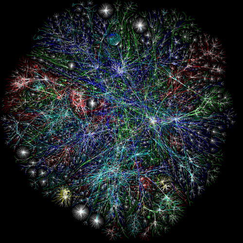
Connexity Graphs: The 2D Saviors of Combinatorial Complexity
A Connexity Graph shows how elements are interconnected using nodes and link lines to represent their connections and help highlight the type of relationships between a group of entities. Typically, nodes are drawn as little dots or circles, but icons can also be used. Links are usually displayed as simple lines connected between the nodes. Additional information can be visualized, for example, by making the node size or the stroke weight of the line proportional to an assigned value. By mapping out connected systems, connexity graphs can be used to interpret the structure of a network through looking for any clustering of the nodes, how densely nodes are connected, or by how the diagram layout is arranged1.
[1] Definition extracted from https://datavizcatalogue.com/methods/network_diagram.html
The diagram can be interactive: filters and direct manipulation of the nodes can be used to explore the data further.
In our use case, the nodes of the diagram are the resources. A delivery node can be linked to a professor, an academic block, and room request nodes, that can be linked themselves to other delivery nodes. The user can reorganize the diagram by manipulating the nodes. He can zoom in and out with the mouse wheel and pan the background. He can explore the connections by double-clicking on a node: it opens all the resources linked to this node. Double-clicking again on the same node closes the connections.
This is obviously the first step. We seek to further improve the visualization in collaboration with the InfoSilem team and to test the understandability and value of such visualization in the planning process.