
Design guidelines for conversational AI interfaces and why a blank text field is not good enough
The broken promise of an input inbox
There is a design decision that almost nobody talks about, yet it shapes every interaction people have with generative AI today: the empty input box. You open a new AI tool, and there it is: a blinking cursor, a blank field, and the implicit instruction: figure it out yourself.
Amelia Wattenberger put it well when she noted that a good tool makes it obvious how it should be used and how it should not be used. A pair of metal mesh gloves tells you it exists to prevent physical harm. A blank text field tells you nothing. It looks identical to a search bar, a login form, and a credit card field. The interface offers no affordances, no sense of scope, no signal of what this thing is actually good at.
This is symptom. Much of what gets called “AI interface design” today is not really design at all. It is a thin wrapper over a language model, shipped quickly and defended with the idea that the AI will take care of the rest. It won’t. The human is still there, still confused, still responsible for the outcome.
This article is about what it would mean to design AI interfaces with genuine intention, specifically conversational interfaces powered by generative AI. It draws on recent Human-Computer Interaction (HCI) research, taxonomy of avaiable AI products, observations about how real users engage with these tools, and a question that is more productive than “how do I design for AI?”: what would it mean for this interface to behave like a thoughtful colleague?
A taxonomy of defaults : what ~50 tools reveal about the gap between principle and practice
Over the last quarter of 2025, we conducted a UI design audit of 48 AI tools, from general-purpose assistants like ChatGPT, Claude, and Gemini, to specialized enterprise tools like IFS IA and Remberg Copilot, to creative generation platforms like Midjourney, Suno, and HeyGen. The goal was to map the interaction design patterns that are actually being deployed at scale, and compare them against what the research suggests.
The audit classified tools across seven dimensions and what emerged was less a landscape of diversity than a landscape of convergence around a single, dominant pattern.
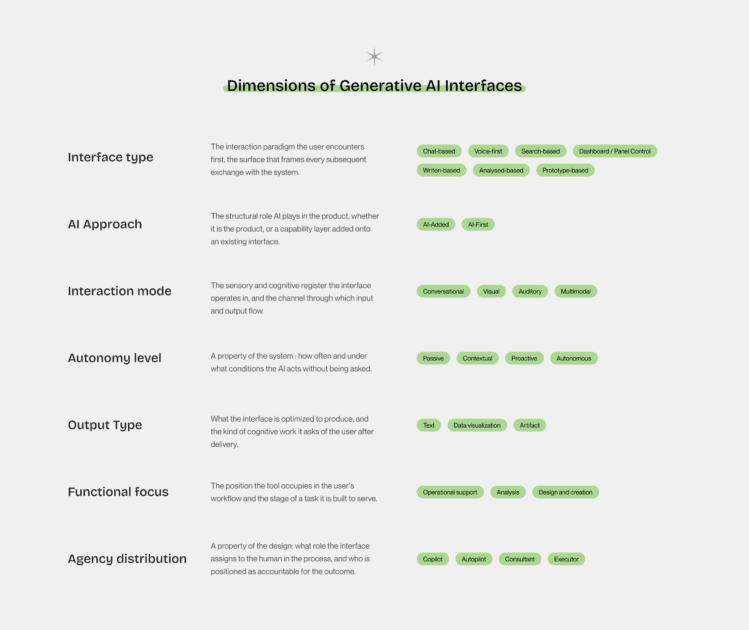
The overwhelming majority of tools in the chat-based category, which remains the largest cluster, present the same interaction model: a text input field, a send button, and a scrolling history of exchanges. The interface type varies; the underlying design logic does not. Whether you are researching a legal question in GenIAl Lexis Nexis, managing a sales pipeline in Modjo, or writing code in GitHub Copilot, the first thing you encounter is a prompt asking you to prompt.
Three patterns the data makes visible
Looking across all 48 reveals reveals which decisions are being made everywhere, which are being made almost nowhere, and which are being made only in specific conditions. Three patterns stand out with enough consistency to be worth naming.
- 1. The chat monoculture. Twenty-nine of 48 tools use a chat-based interface as their primary or co-primary surface, across legal research, music generation, enterprise analytics, coding assistance, roleplay, creative writing, and market intelligence. The same interaction skeleton appears in contexts with fundamentally different user needs, cognitive demands, and output requirements. It is a default that has calcified quickly, driven by the recognizability of the format and the speed at which a chat interface can be shipped.
The risk of monoculture is not that chat is wrong. The counter-examples in the study are instructive precisely because they are exceptions: Elicit built a research interface organized around the structure of a literature review, not a conversation. IFS IA and Remberg Copilot lead with dashboards because their users are diagnosing operational failures. Superwhisper removes the interface almost entirely, making the interaction as close to natural speech as the technology allows. These tools make a design argument. Most of their peers simply make a product.
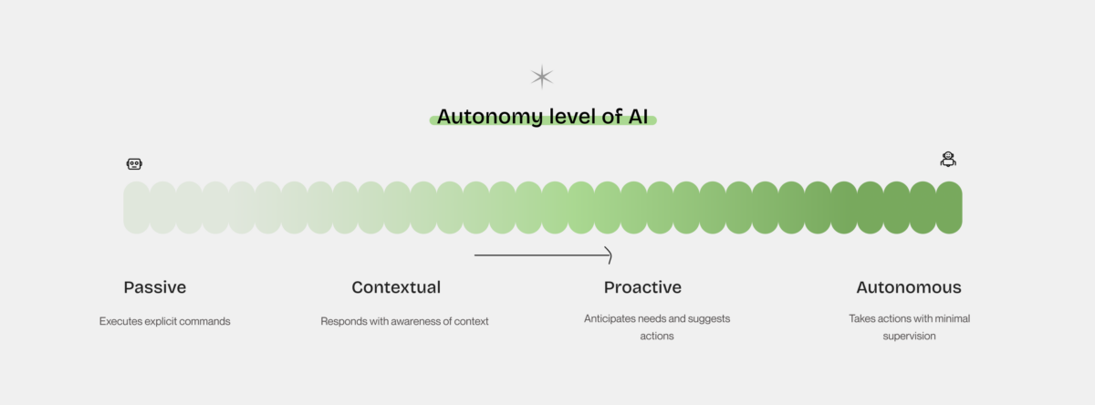
- 2. Proactivity is almost entirely absent by design. The autonomy spectrum is populated at both ends: passive tools that wait for commands, autonomous tools that generate complete artifacts. The middle specifically the proactive tier, where the AI initiates based on its own read of the user’s context is where the most significant gap lives. Most tools described as “proactive” in their marketing are, in practice, reactive: they respond to inputs quickly and comprehensively, but they do not initiate. The distinction is not semantic. A truly proactive interface requires a design decision about when the AI should speak up unprompted, which requires knowing the user’s workflow well enough to have an opinion about it. That knowledge demands specificity. It demands to have a clear enough picture of what the user is trying to accomplish to make a judgment call on their behalf. Most general-purpose tools cannot or will not make that call. The proactive design space remains almost entirely open.
- 3. Copilot is not a design decision, it is a marketing category. The word copilot appears in product names, marketing copy, and interface labels throughout the study. It has become the dominant metaphor for AI-assisted work, to the point where it no longer describes anything specific. In the taxonomy, tools as different as Duck AI, Claude, GitHub Copilot, Office 365 Copilot, and Rovo all carry the copilot designation in some form. What separates the tools that earn it from those that merely claim it is a single observable design property: the tools that earn it make the AI’s reasoning visible at every step showing sources and displaying confidence. They have made more deliberate choices about surfacing reasoning, showing sources, and structuring the interaction around the user’s decision process rather than around the AI’s output. The tools that claim but do not earn it present conclusions and ask the user to trust them. One design makes the human more capable. The other makes the human more dependent.
Most general-purpose assistants cluster at the contextual level, they understand what you say but wait for you to say it. The proactive tier, which most closely corresponds to what Weisz et al. mean by co-creation and what Seeber et al. describe as a genuine machine teammate, remains rare. Tools that initiate, suggest, and adapt without being asked are still the exception.
The interface does not help users understand what is the langage of the AI, what it is doing, how it thinks, why it is doing it, or when to trust it. Users end up spending more time to complete a task precisely because they expend energy trying to figure out what language the AI gets.
This taxonomy and its patterns are most useful as a mirror. The categories only earn their place when held up against your own work and when the gaps they reveal become design decisions rather than oversights.
Design Guidelines for AI
Design has accumulated a rich body of knowledge over the past few decades, for exemple, Nielsen’s heuristics and Shneiderman’s eight golden rules. These remain relevant. But generative AI introduces challenges that none of them were built to address.
Weisz et al., in their 2024 paper Design Principles for Generative AI Applications presented at ACM CHI, identify three characteristics that make generative AI design genuinely different from what came before.
The first is a new interaction paradigm. Jakob Nielsen has called it intent-based outcome specification: instead of clicking, typing, or touching to instruct the computer how to do something, users now specify what they want and leave the how to the model. This is powerful and completely uncharted territory for most users, who have no prior mental model for it.
The second is generative variability. Every time you press generate, you get different results. This directly contradicts one of the oldest principles in interface design: that systems should behave consistently and predictably. How do you help users build mental models of systems that are probabilistic by nature?
The third is a new class of risks. Hallucinations, toxic content, copyright issues, privacy leakage. These behaviors reflect structural properties of generative models and therefore require deliberate consideration in interface design.
These three shifts call for design frameworks developed specifically for human–AI interaction. In response, Weisz et al. propose six design principles organized around two complementary goals: reinterpreting established design concerns in the context of generative AI and addressing challenges unique to generative systems.
What follows is a reading of what these principles ask of designers in practice.
Design Responsibly is the foundational principle. It asks designers to take a socio-technical perspective and think not only about what the system can do, but about who might be harmed when it does it wrong. In practice, this means conducting human-centered research before reaching for AI capabilities, identifying value tensions across stakeholders, and actively testing for user harms such as bias, misinformation, misuse. Should emergent behaviors be surfaced to the user, or restricted? A conversational interface that allows open-ended interaction will inevitably surface capabilities the product team never intended.
Design for Mental Models aligns users’ expectations with system behavior by building on their existing understanding of AI’s capabilities and limitations. Through contextual explanations and examples, it helps users make sense of key characteristics of generative systems, including the possibility of multiple valid outputs for the same input. By making this variability understandable, interfaces support more effective interaction. In its most advanced form, the principle includes systems that adapt to users’ expectations and preferences over time, fostering a process of mutual adaptation between humans and AI.
Design for Appropriate Trust and Reliance may be the most counterintuitive of the six. The goal is not to maximize trust in the AI, it is to calibrate it. Users should trust the system where it is reliable and doubt it where it is not. The principle calls for transparency about capabilities and limitations, for providing rationales for outputs (not just outputs), and even for deliberately introducing friction at key decision points to slow users down when stakes are high. The phrase in the paper is pointed: “use friction to avoid overreliance.” It means we can design for appropriate trust by designing against the path of least resistance.
Design for Generative Variability : where the second characteristic names variability as a challenge to be understood by the user, this principle treats it as a design material. Rather than minimizing the fact that the same prompt can produce different results, the interface should make that space of possibilities navigable through multiple distinct outputs, visible differences between them, and mechanisms for curation and annotation. The interface should make visible the fact that there was no single “right answer”, only a space of possibilities.
Design for Co-Creation shifts the framing from user-as-operator to user-as-collaborator. Instead of presenting AI outputs as finished products, interfaces should help users craft effective prompts, offer controls that let them adjust parameters without writing code, and support genuine co-editing, where both the human and the AI system can improve the generated artifact over time.
Design for Imperfection closes the set with perhaps the most honest acknowledgment in the paper: AI outputs will sometimes be wrong, incomplete, or misaligned with expectations. The design challenge is make uncertainty visible, to offer domain-specific metrics for evaluation, and to provide clear paths for users to improve or correct outputs. Feedback mechanisms that close the loop back to training are part of this principle as well.
Taken together, these six principles frame design as an integrative practice. They require designers to simultaneously consider users’ capabilities, system limitations, social context, and the dynamics of human–AI collaboration. In this sense, design becomes a practice of translation, one that defines what kind of relationship a person should have with a system that will inevitably get things wrong.
Who is actually sitting across the machine?
Before designing any interface, it is worth asking who are the people who will actually use this, and how do they think about AI?
Research from Nielsen Norman Group identifies four distinct user profiles based on two axes: prompt fluency, the ability to communicate intent effectively to a generative AI system, and output literacy the ability to critically evaluate what the system returns.
The AI novice is new to these tools, unsure how to prompt, and unable to identify errors or gaps in outputs. The naive power user has developed fluency in prompting, which means that they interact confidently and get polished-looking responses, but they tend to accept outputs at face value and miss hallucinations or subtle errors. This is arguably the most dangerous profile from a design perspective because the interface has given them the confidence of competence without the corresponding critical capacity.
The skeptical abstainer understands how AI outputs should be treated, but avoids engaging with the technology due to distrust, ethical concerns, or personal preference. The AI expert combines fluent prompting with genuine skepticism, using AI selectively and verifying when stakes are high.
These profiles do not map neatly to job titles or technical backgrounds. A developer may be a naive power user. A nurse with no technical training may be a skeptical abstainer. What matters for design is that the interface should not assume a single user type and that the naive power user, who is likely the most common profile today, is precisely the person most exposed to a related to the cognitive bias.
The concept of automation bias, the tendency to over-rely on automated systems and under-apply one’s own judgment, is well documented in high-stakes domains. In AI interfaces, it manifests when a fluent user accepts a confident-sounding output without checking it. The interface design choices described by Weisz et al. as making uncertainty visible, providing rationales, using friction to slow down at decision points are, in part, design responses to this cognitive tendency. Literacy and interface design work together, or they don’t work at all.
Designing the colleague, not the search bar
There is a method that tends to produce better AI interface decisions than any framework alone: ask, for every interaction pattern you are considering, how would a thoughtful human colleague actually do this?
Human collaboration has been refined over a very long time. When we work well with a colleague, certain things tend to be true: they signal what they are good at before we ask them to do something; they ask clarifying questions rather than guessing; they show their reasoning when it matters; they know when to step back and let us drive.
These behaviors have direct translations into interface design decisions.
Signal your range before the user has to ask. A colleague who sits down for the first time does not stare at you blankly. They introduce themselves, mention their experience, maybe give an example of the kind of work they have done. An AI interface can do the same, not through a wall of onboarding text, but through contextual suggestions, example prompts, and visible scope markers. The Wattenberger critique of the blank input field is exactly this: the interface places the entire burden of understanding on the user. A well-designed interface redistributes that burden.
Ask before assuming, but ask well. One of the most common failures in conversational AI interfaces is the binary between two extremes: either the system generates immediately from an underspecified prompt (producing something generic and often wrong), or it asks so many clarifying questions that the interaction becomes an interrogation and users tend to abandon the chat. The design principle from co-creation is instructive here when it says to provide input parameters as controls, not as conversation turns. Let users adjust scope, tone, domain, and audience through the interface itself, so they don’t have to rephrase their request six times.
Show your reasoning when it matters. The “Design for Appropriate Trust” principle asks for rationales. In practice, this means giving users enough information to decide whether to trust a specific output, not trust the system in general, but trust this output for this task. A human colleague presenting a recommendation would say: here is what I found, here is why I think it applies, and here is where I am less sure. AI interfaces that present outputs as finished artifacts without any window into their provenance are systematically misaligned with what appropriate trust requires.
Know when to step back. Wattenberger describes a “no man’s land” in AI-assisted work as the zone where the human is still required to make decisions but is no longer in control of the outcome. At the far end, where the machine does everything, there is no craft, no responsibility, no real engagement. The design challenge is to keep the human in a position of meaningful agency without requiring them to do so much that the AI provides no value. This is what Seeber et al. mean when they describe a machine teammate as something that “participates in cognitive decision making with human actors”, not something that replaces cognitive decision making.
Guidelines are not the destination
There is a risk with any discussion of design principles that readers come away with a checklist mentality. Six principles, four user types, four interface behaviors, enough, it may seem, to design a successful AI interface.
The real value of these frameworks lies elsewhere.
The principles proposed by Weisz et al. are a set of lenses, each of which reveals something that a purely technical approach to AI interface design tends to miss. The value of the literacy framework from NN/G is not that we can tag each user with a label and serve them a different UI. It is that it forces the question: what does this person actually need in order to collaborate effectively with this system, and am I designing for that?
The anthropomorphization heuristic what would a thoughtful colleague do? is useful for the same reason. It generates better questions and avoid automatic answers. Principles exist to guide the designer. It doesn’t mean that the designs have to apply strictly and correctly to every principle. A good AI interface is one where a real person, with real limitations and real goals, can work with an AI system in a way that makes them more capable and avoids dependence.
The blinking cursor at the beginning of this article lacks affordances in the technical sense, but it also frames the interaction as a simple exchange: you speak, the machine responds, and the interaction is complete. A more productive framing understands human–AI interaction as collaboration rather than transaction, and as shared work rather than query and response.
Bibliography
- AI Is First New UI Paradigm in 60 Years
- https://doi.org/10.1007/978-3-031-49425-3_1
- Why Chatbots Are Not the Future of Interfaces
- How AI Literacy Shapes GenAI Use
- https://dl.acm.org/doi/10.1145/3613904.3642466
- https://www.sciencedirect.com/science/article/pii/S0378720619303337
- State of AI 2026 – AI Market Size, Investment, and Industry Data
- Ben Shneiderman
- 10 Usability Heuristics for User Interface Design
- 4 Metaphors for Working with AI: Intern, Coworker, Teacher, Coach